
Sakura Pink
Sakura Pink is inspired by the fleeting beauty of cherry blossoms.
It embodies calmness, elegance, and ephemerality—designed to adapt across fashion, photography, and product design.
The Birth of Sakura Pink
This color captures the poetry of impermanence—soft and serene, balanced with warm accents. To define its role, I developed a chromatic framework of “allied” and “contrasting” colors, ensuring consistency across applications.
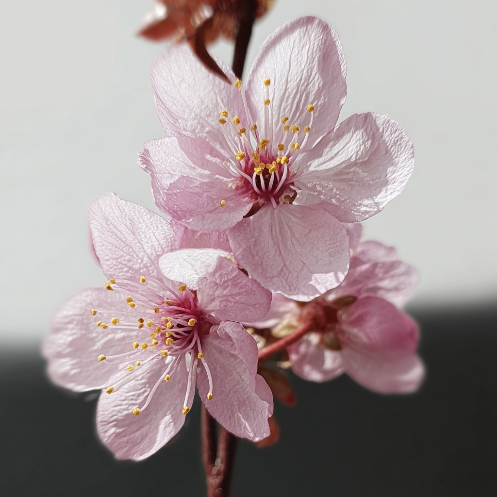
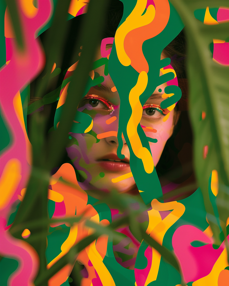
Enemies


Every color needs one moment that defines it. This image captures its essence in one glance.
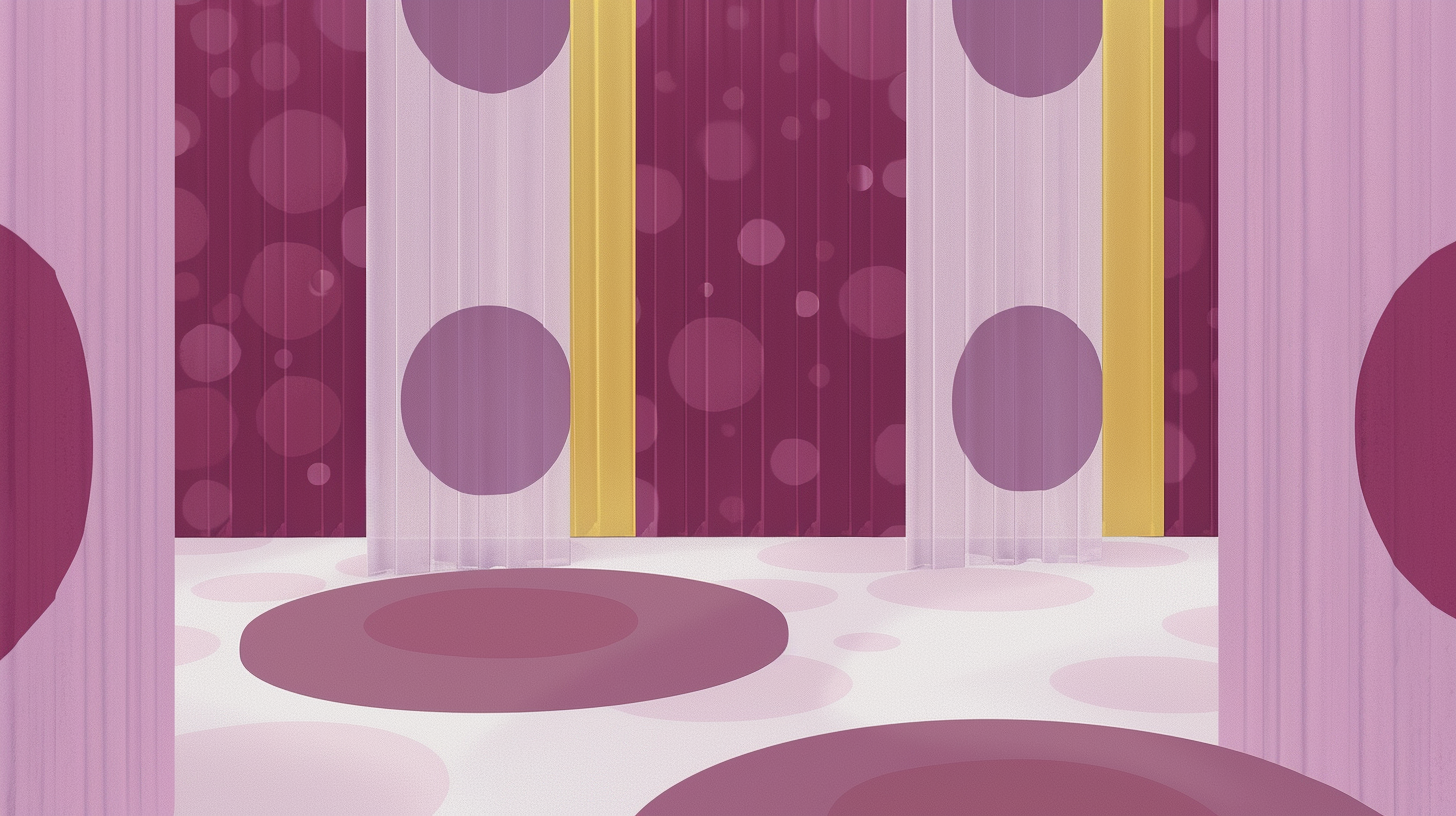
Worn by Surfaces
Rosa Sakura in patterns and fabrics, bringing freshness and contemporaneity.


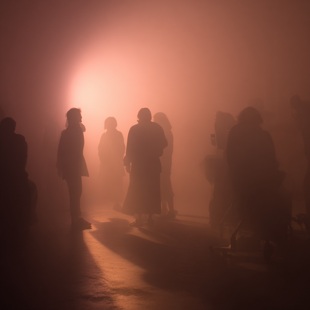
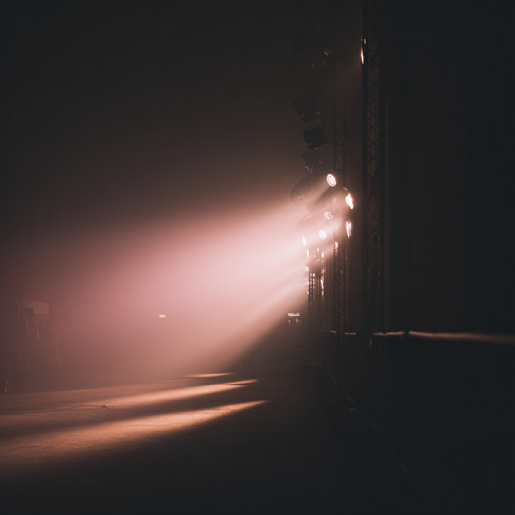
Application in Film & Photography
Light and shadow translate Sakura Pink’s mood. An intimate, cinematic halo that suspends time. 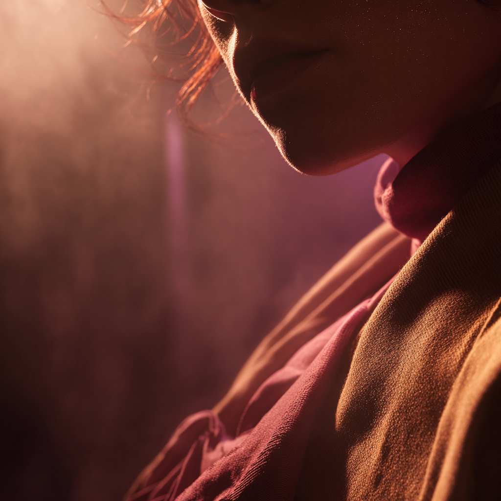


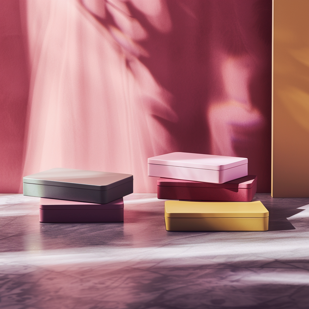
Packaging Design
Sakura Pink can be imagined on product packaging, such as tea brands, candles, or boutique items. Its soft elegance conveys refinement, while warm accent colors guide the eye, creating a sophisticated and approachable identity.

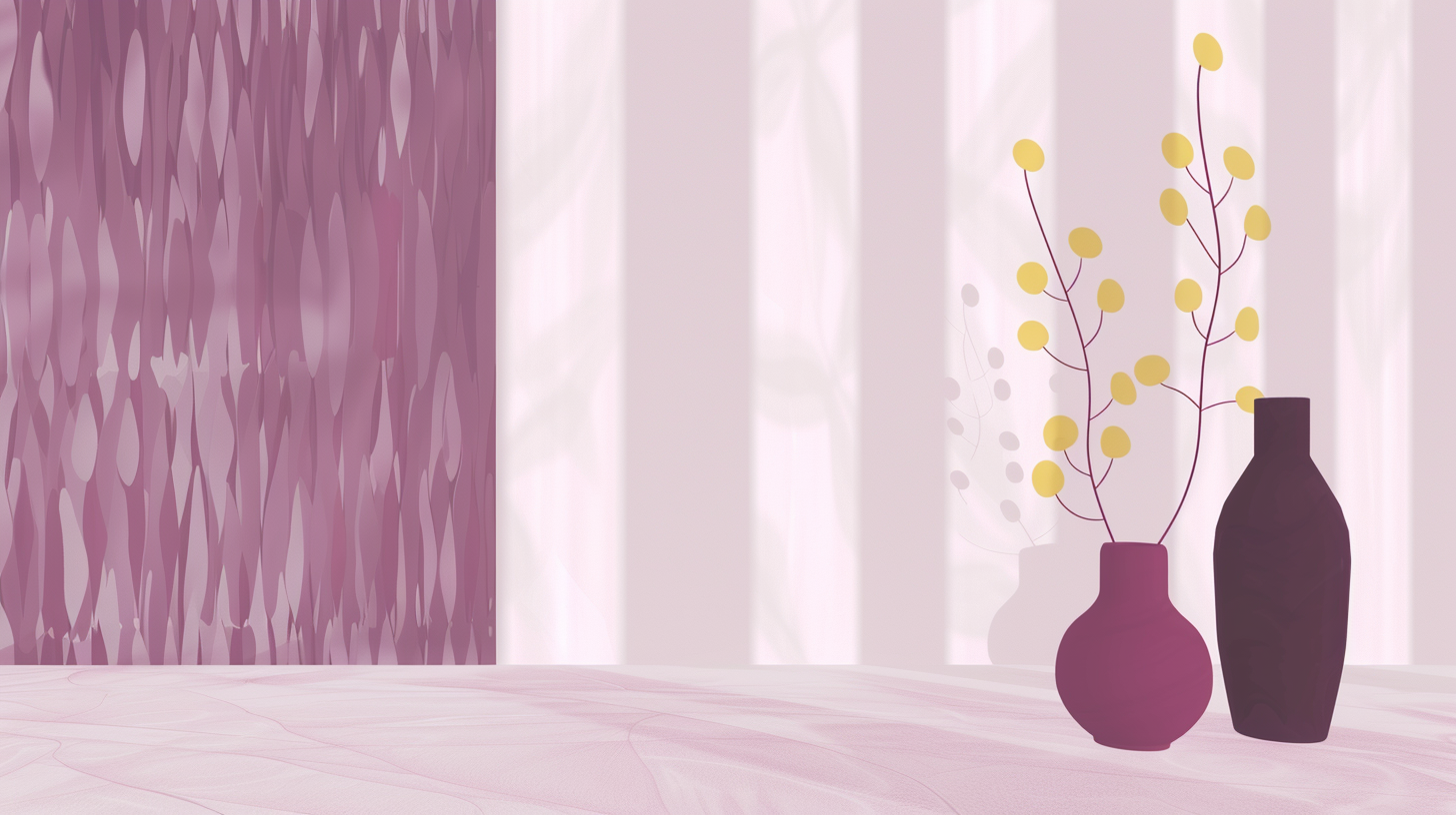
Illustrations


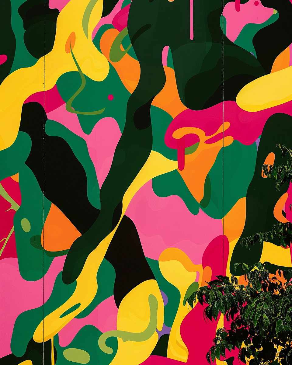
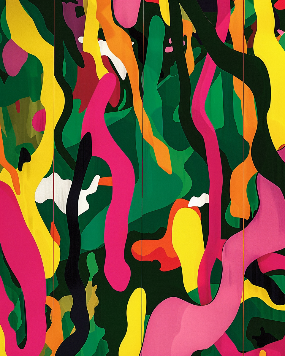
Tropical Twist Green

Fearless, electric shade of deep green inspired by the richness of tropical rainforests and the adventurous energy of faraway escapes.
This color embodies lush vitality, balancing nature’s serenity with a daring, high-energy twist. Its rich base evokes the depth of green foliage, while its pairing with neon accents brings a playful, contemporary edge.


Village Siesta Light Blue
Celeste Siesta de Pueblo is a soft, enveloping shade that evokes the calm of a warm afternoon in a small village.
It blends the serenity of the sky at sunset with the coziness of an afternoon siesta, creating a sense of peace and nostalgia.I thought this color for designers, creators & brands seeking a hue that feels organic, timeless, and quietly poetic.


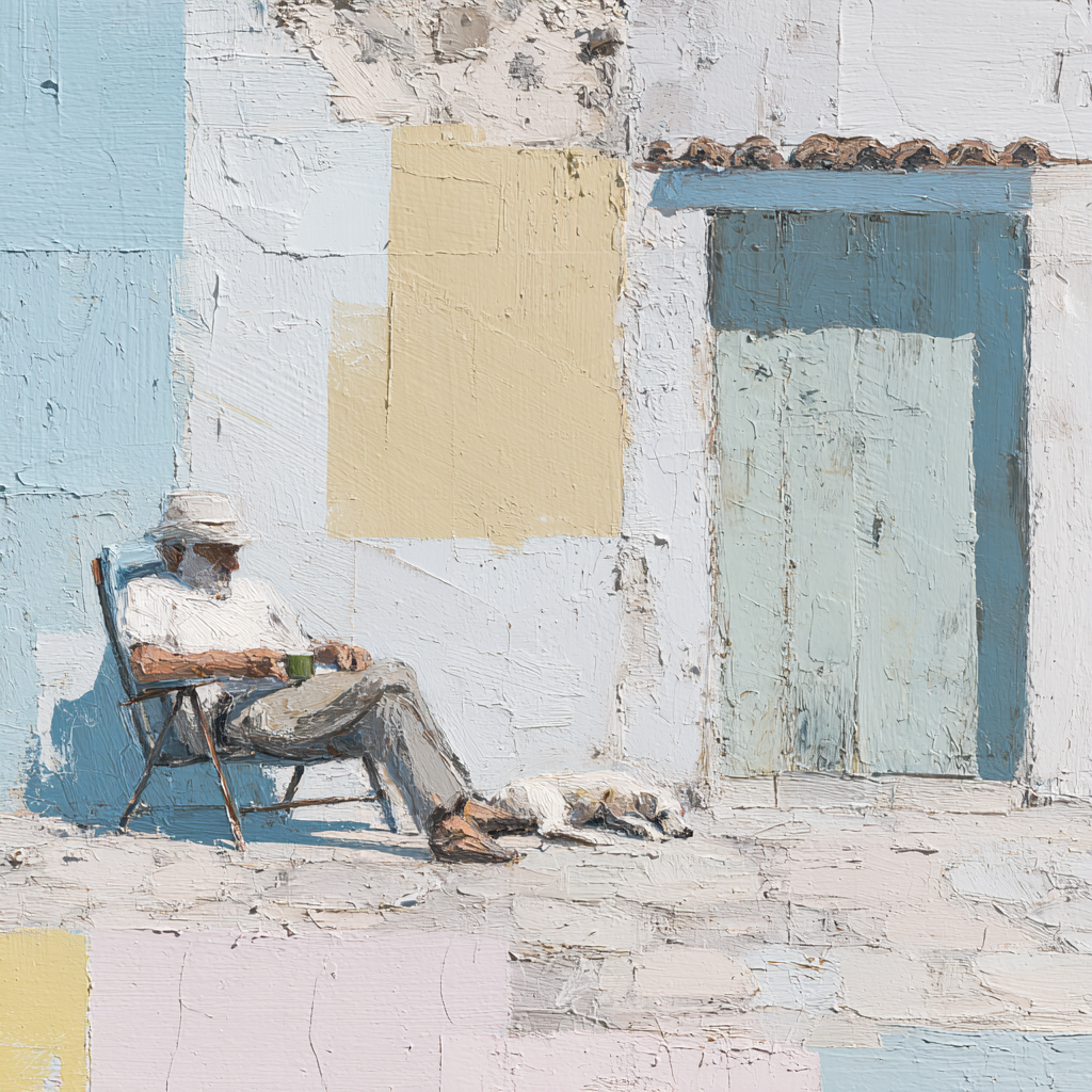

Mood & Emotion
It evokes the sensory experience of sunlit villages and slow afternoons: plastered walls weathered by time, cotton dresses swaying in warm breezes, and the stillness of siesta hours.The soft blue conveys serenity and reflection. Its sun-faded companions — Dust White, Olive Green, and muted Yellow — add warmth and grounding, creating a palette that feels both timeless and intimate.


Applications
Architecture & Interiors: shutters, walls, ceramics, floor tiles, especially where light shifts during the day.Fashion: linen, cotton, or flowing garments that carry movement and breath.Branding: artisanal, heritage, wellness, and cultural projects looking for warmth and authenticity.Photography & Film: narratives of nostalgia, rural life, Mediterranean summers, or moments of suspended time.


