Inventing Colors
A study on color as identity - Part I

Sakura Pink
Sakura Pink is inspired by the fleeting beauty of cherry blossoms.
It embodies calmness, elegance, and ephemerality—designed to adapt across fashion, photography, and product design.

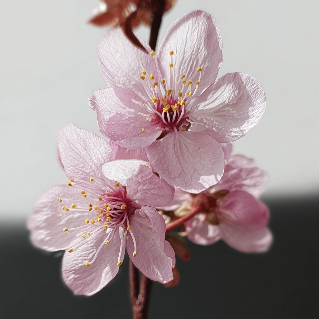
The Birth of Sakura Pink
This color captures the poetry of impermanence—soft and serene, balanced with warm accents.
To define its role, I developed a chromatic framework of “allied” and “contrasting” colors, ensuring consistency across applications.
Color Palette

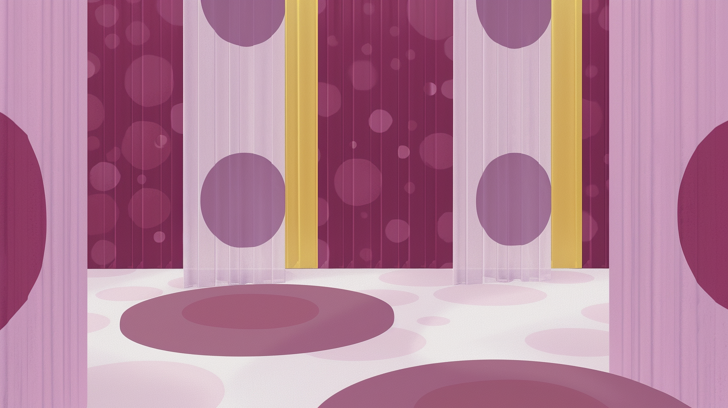
Enemies


Every color needs one moment that defines it. This image captures its essence in one glance.
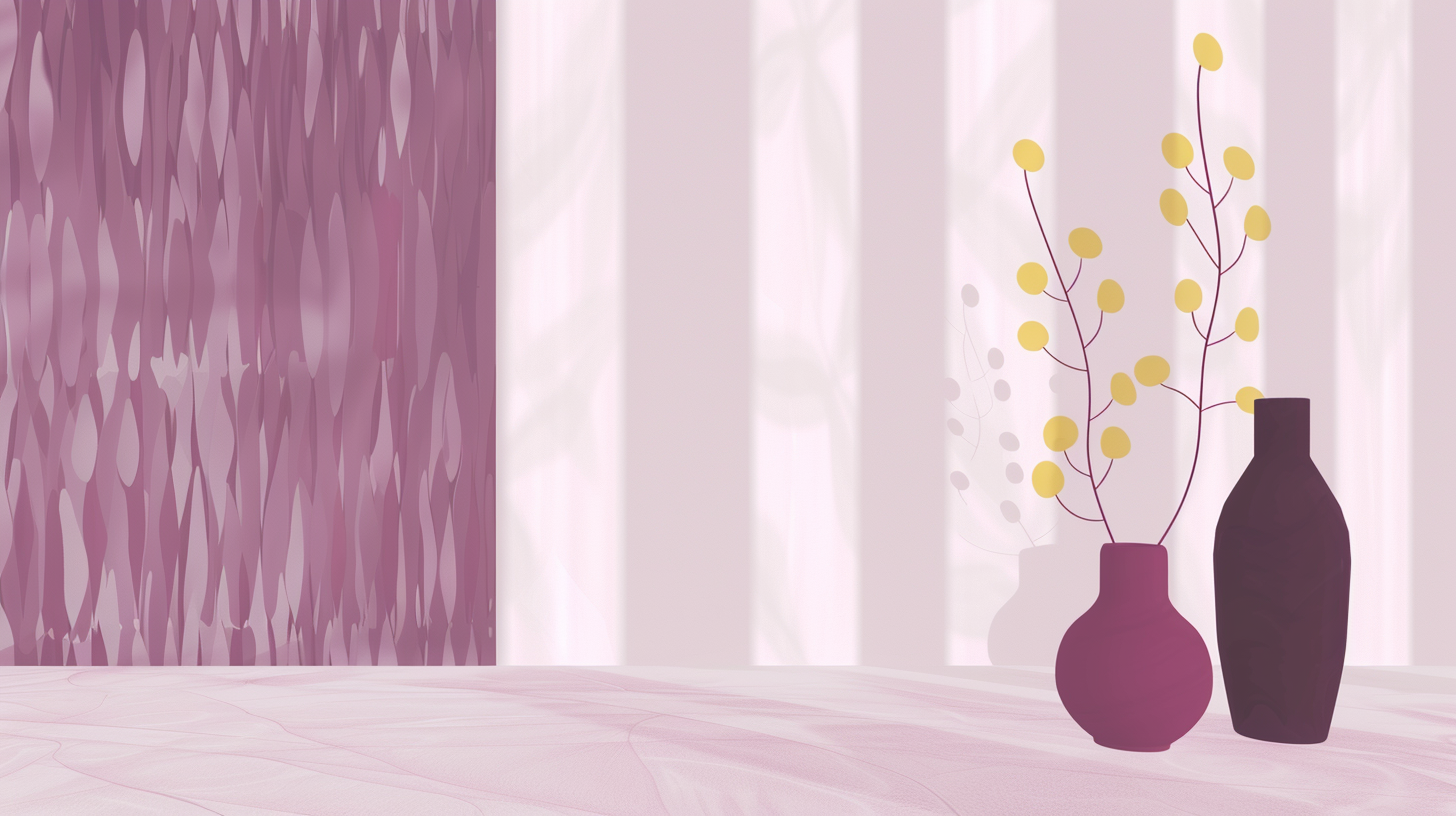
Worn by Surfaces
Rosa Sakura in patterns and fabrics, bringing freshness and contemporaneity.


Application in Film & Photography
Light and shadow translate Sakura Pink’s mood. An intimate, cinematic halo that suspends time.


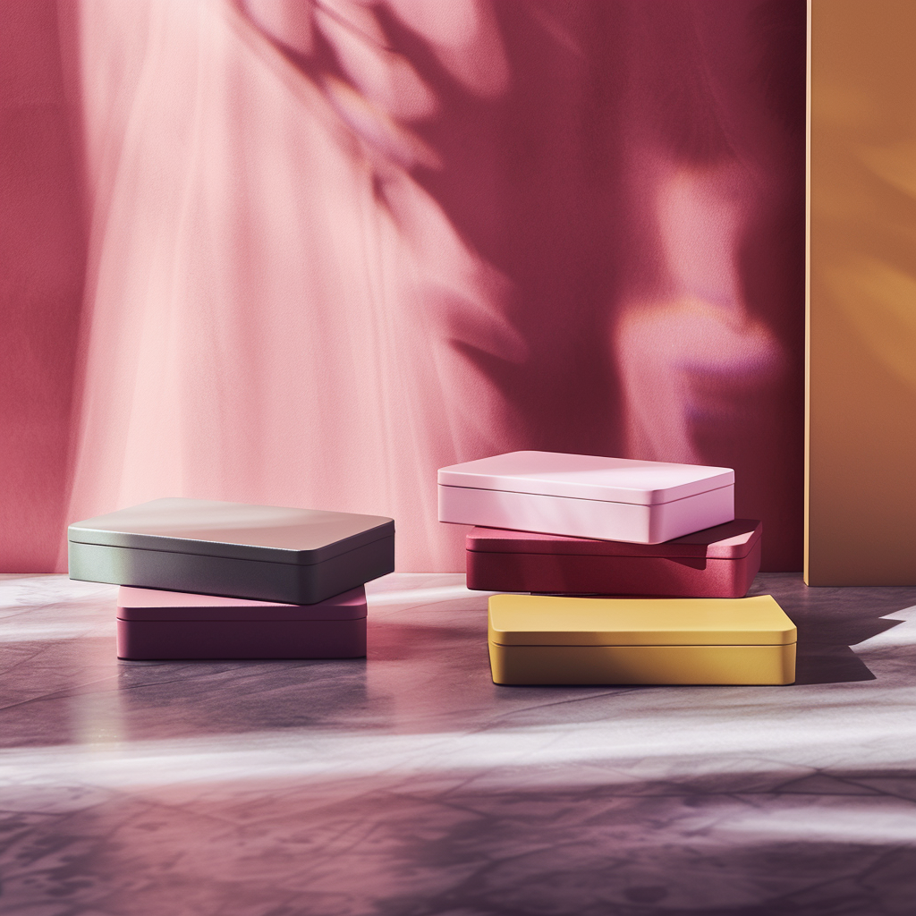
Packaging Design
Sakura Pink can be imagined on product packaging, such as tea brands, candles, or boutique items. Its soft elegance conveys refinement, while warm accent colors guide the eye, creating a sophisticated and approachable identity.


Illustrations